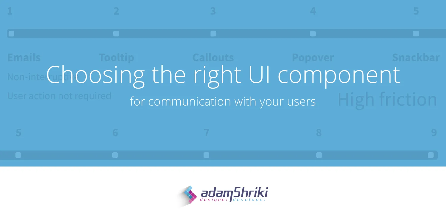
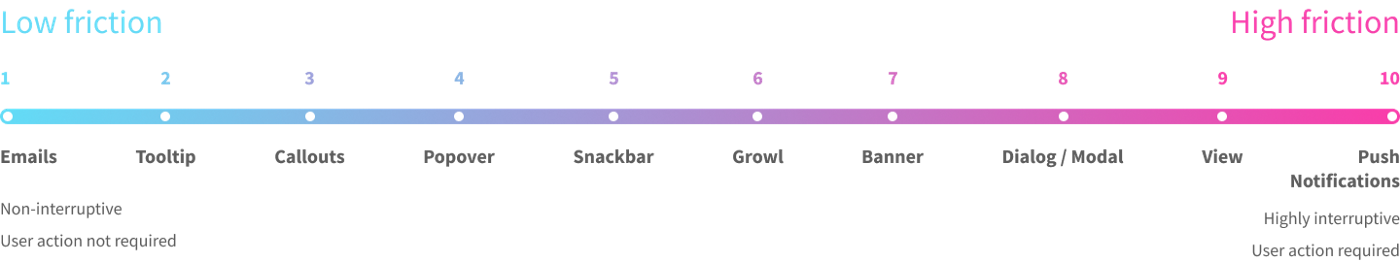
In this article, I'll explain how to choose the right UI component for the type of message you want to deliver to your users. For this purpose, I created a friction scale which rates UI components according to the level of friction they create for users.

Why Do We Need This?
Communicating with users is crucial. Messages can be delivered in many ways and by different mediums. Different stakeholders in the company want to deliver different kinds of messages — product owners might want to let users know about new features, marketing managers want to upsell or advertise, and support agents want to help users complete certain tasks or flows.
Creating a structured scale for different types of messages will help us organize and prioritize our messages. This will help our users understand us better and hopefully, even love us.
Push Notifications — (10) Highest Friction
When allowed, push notifications deliver high friction messages on mobile and web applications. They show up on top of everything else, usually accompanied by a sound, even if the user isn't currently using the app.
- Deliver high priority call-to-action messages
- Let users know of something valuable for them
💡 Ask users for permissions at the exact moment they might benefit from granting it. Use notifications wisely and cautiously so users will develop empathy towards your messages, rather than resentment.
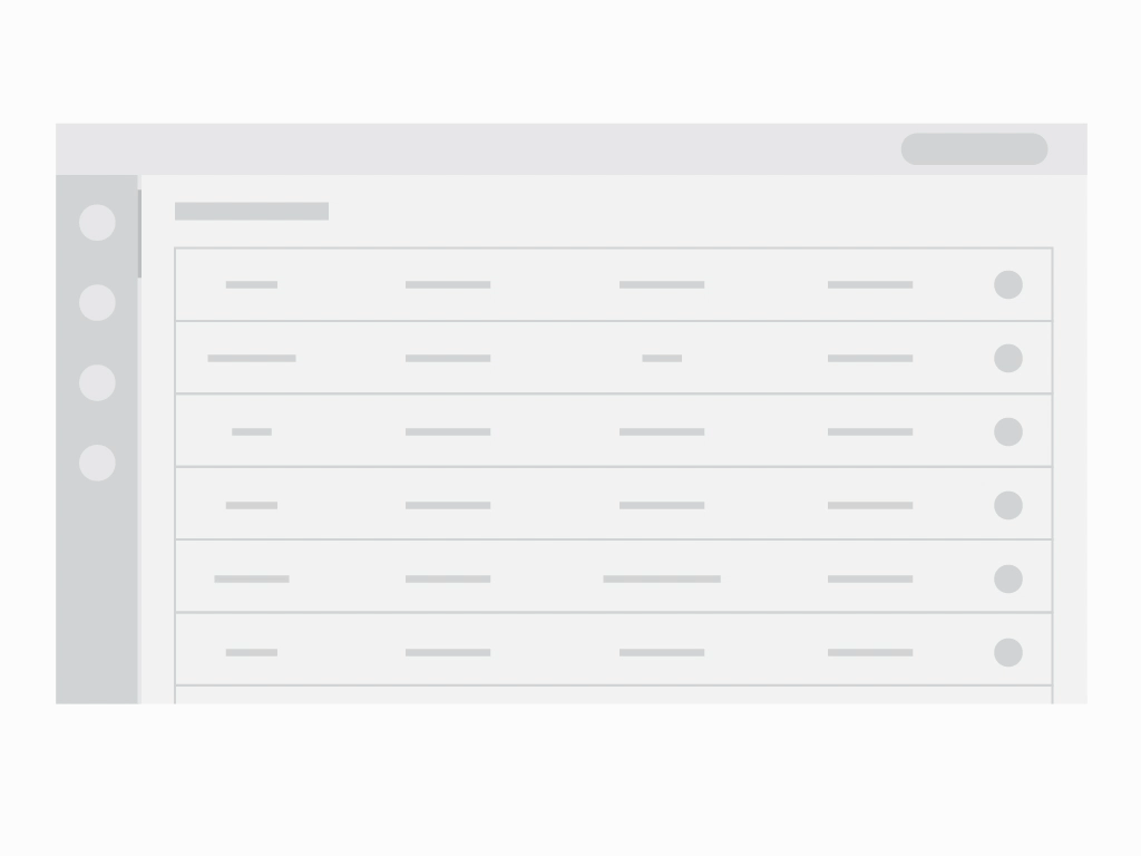
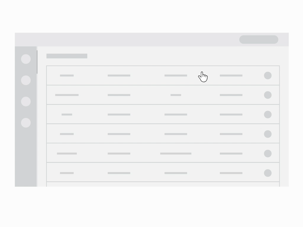
View — (9) High Friction

Some content is best experienced in a separated, dedicated view, allowing users to focus on one individual object and its related actions at a time. It is the highest friction inducing form of showing content inside the app, so its use should be justified.
- Focus and engage users more deeply with specific content and its related actions
- Show complicated data that requires a lot of on-screen real estate
Dialog / Modal — (8) High Friction
Dialogs appear without warning, requiring users to stop whatever it is they're currently doing. Use them sparingly, since not every choice or setting change justifies such an interruption.
- Keep users in a certain flow — allow users to perform a particular action without exiting the screen they're currently on
- Capture users' focus and remove secondary distractions
- Bring attention to a choice users need to make or to specific information they need to know before moving forward
Banner — (7) High Friction

Banners display important, succinct messages and provide optional actions for users. They should be displayed at the top of the screen, below a top app bar. Since their location is consistent and they're non-modal, they allow users to either ignore them or interact with them at any time.
- Inform users of site-wide issues
- Display warnings or errors that will directly impact users' ability to complete certain tasks
Growl — (6) Medium Friction

A Growl displays a promoted message without interrupting the ongoing use of the app. In addition to text, it usually shows an image or an icon, as well as a CTA that contains a deep link or an external link. It floats on top of all other elements at the bottom left or right corner of the screen and needs to be explicitly dismissed.
- Promote certain communications without disrupting users
- Show warnings or alerts triggered in the background that don't have an immediate effect on users
Snackbar / Toast — (5) Medium Friction

Snackbars inform users of a process that an app has performed or will perform. They appear temporarily, at the bottom part of the interface. They shouldn't interrupt the user experience and don't require any user input to disappear. Snackbars automatically disappear after four to ten seconds.
Popover — (4) Low-Medium Friction
Popovers contain helpful information like explanation of context. They appear next to the relevant element and may contain actions related to it. They can be triggered independently or by a certain action.
- Provide extra information that might be useful, combined with the question mark icon
- Provide direction for filling out a form
- Offer more actions related to a certain element in the interface
Callout — (3) Low Friction
Callouts are text excerpts, used as a visual cue to draw attention to the text. They're used to help direct users towards important pieces of information. They should appear on top of the element they refer to, without blocking any other part of the interface.
- Warn users before asking them to take action, in anticipation of a significant change
- Let users know something has gone wrong — as an error message
- Let users know they have successfully completed an action — as a success message
- Alert users about additional information without requiring an action — as an informative message
Tooltip — (2) Low Friction
A tooltip is a brief, informative message that appears when a user interacts with an element within a GUI. Tooltips are usually triggered through a mouse-hover or keyboard-hover gesture. They are highly contextual and specific — don't use tooltips for information that is vital to task completion.
- Provide information for unlabeled icons
- Provide descriptions or explanations for their paired element
- Provide brief and helpful content inside the tooltip
- Position the tooltip so it doesn't block related content
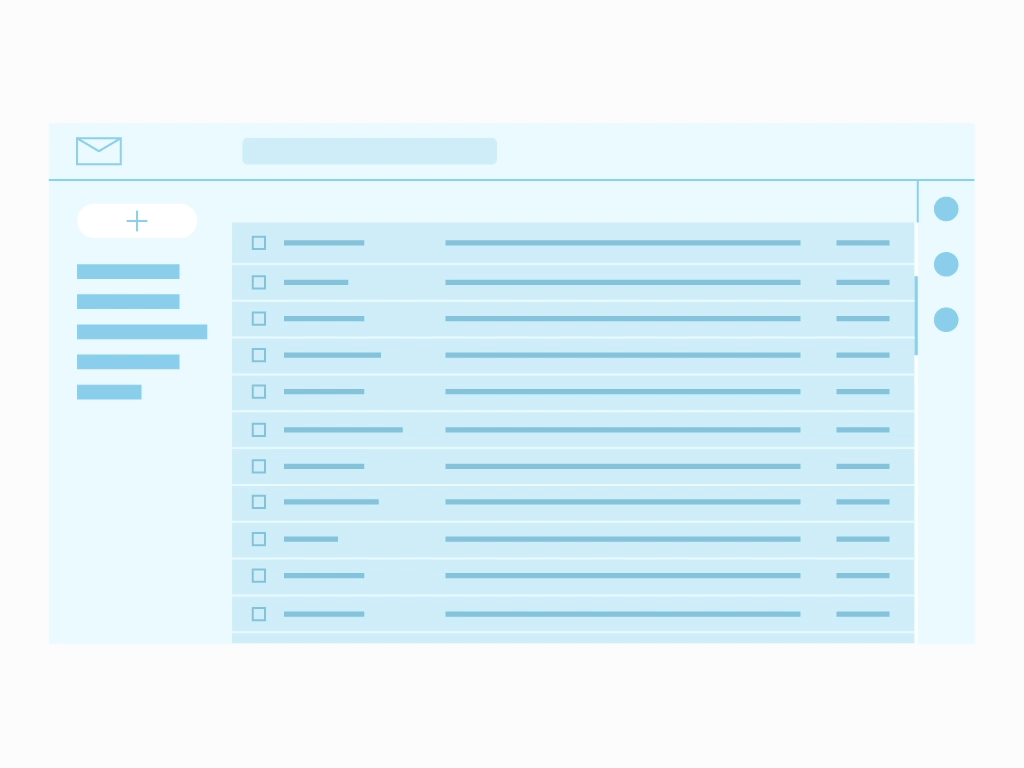
Email — (1) Lowest Friction
Email messages are relayed through email servers provided by all Internet Service Providers. While emails are low-friction, they should be fully customizable so each user can tailor them to their own interests.
- Activate user accounts
- Deliver welcome or onboarding messages
- Invite or share content with other users
- Notify about activity
- Send reports and dashboards
- Reset password or perform two-factor authentication
- Notify users regarding security issues or changes in their account
Conclusion
We've seen many different types of messages used for different purposes. Choosing the right element depends both on the content and the context of the message. Have fun in the world of non-disruptive messages!

